Showing posts with label infographic. Show all posts

Tuesday, 5 May 2015

Top 8 Proven Benefits of Business Blogging

Many small business owners put off blogging thinking this “fad” is just a waste of their time and effort. This line of thinking is not what successful Digital Marketers have with regards to business blogging.
As much as 81% believe business blogging is a critical business process according to Hubspot’s Inbound Marketing Report.
The latest iteration of this report, generated from a survey that involved 3,500 marketing professionals, revealed that blogging is one of the most important lead sources for their business and is highlighted as having the most substantial impact in terms of ROI performance.
These figures are just some of the factual evidences that proved blogging as a very important business resource. If you’re still not convinced with these figures, then let the following top proven benefits change your mindset about business blogging.
1. Business Blogging Generates Relevant Traffic  – eMarketer previously predicted that as much as 60% of the entire American internet population will read blogs at least once a month. Figures could have gone way over that threshold, with the likes of HubSpot confirming that at least 46% of people online read blogs at least once a day.
2. Business Blogging Helps You Generate More Leads – Companies that harnessed the power of business blogs reaped the fruits of their efforts by generating up to 67% more leads than businesses without blogs.
3. Business Blogging Helps Your Acquire New Customers – The 2013 version of HubSpot’s report highlighted the same figures, with as much as 82% of marketers surveyed getting a new customer by blogging daily. The latest update of HubSpot’s report highlighted that blog content creation is the top inbound marketing project for companies in North America, Europe, Middle East and Africa.
4. Business Blogging Generates a Positive Marketing ROI – In 2013, HubSpot reported that as much as 79% of companies with blogs generated a positive ROI for all their efforts. The recent version of this report highlighted that blogs remain to have the highest overall impact in terms of generating a positive ROI, with businesses and marketers who focused on business blogging generating up to 13 times more likelihood of generating a positive ROI.
5. Business Blogging Establishes You as an Industry Expert or Leader – The Internet is a great equalizer with the fact that even small businesses can go head-to-head with large corporations online by developing the trust and loyalty of their targeted customers. They can develop such clout as an industry leader or an expert through the valuable information they can share though their business blogs.
6. Business Blogging Develops Stronger Customer Relationships – One of the attributes of business blogging that differs itself from traditional push advertising is the engagement and interactive facilities present in blogs that can help you develop stronger relationships with your customers. You and your audience can engage in healthy conversations through the comments areas commong to most blogs.
7. Business Blogging Builds a Strong Social Media Presence – In Social Media marketing, your brand and business can be discovered by targeted audiences that can eventually turn into leads and sales. But like any other digital marketing channel, social media needs content, preferably evergreen content that you can generate through your business blogs.
8. Business Blogging Drives Long-Term Results – Consider this fact: HubSpot reported that as much as 70% of website traffic each month was not generated by their active posts for that month – but from posts that were published in previous months. What this means is that an article or a blog post you publish today can still create a big impact on your business for days, months or even years to come. That’s long term benefits for you!
Want more? See the infographic below!

Top-8-Proven-Benefits-of-Business-Blogging
http://www.business2community.com/infographics/top-8-proven-benefits-business-blogging-infographic-01219725

Sunday, 5 April 2015

2 min read How to Design the Perfect Logo (Infographic)

How to Design the Perfect Logo (Infographic)
Close your eyes and imagine Apple’s logo. Now think of Nike’s. How about Target’s? We’re willing to bet that you conjured up images for each in your mind’s eye in less than a second or so. They’re that memorable.
As you can see, logos are so much more than simple symbols. They’re epic icons. Logos are the face of your company, the deliverers of the all-important lasting impression, crucial visual representations of your business, what you do and what you’re about. Accordingly, the utmost care and meticulousness should be taken when designing yours. If you already have a logo, the same goes for redesigning it. Spare no attention to detail.
From the font to the color, to the use of negative space and beyond, the aesthetic elements of a logo greatly impact how your company (and its offerings) are perceived by customers.
Does it attract them or repel them? Does it stand out or fade into the background? Does it distinctly identify your brand or confuse it with your competitors? These are all critical questions to ask during the research and design phase, but far from the only ones, only a smattering of the main ingredients for the master recipe for cooking up a successful logo.
Check out the famous logo-packed CompanyFolders infographic below for a complete list of specific, actionable tips and ideas to help you design the best logo possible for your brand.
Click to Enlarge+
design business logo (Infographic)

Monday, 16 March 2015

Three great examples of high-performing visual content marketing


Danny Ashton shares examples of high performing visual content-marketing:


CookSmarts.com

C:\Users\Stephanie\Documents\Great examples of visual content marketing\salad-infographic.png
This infographic caught the team’s eye from day one. ‘50 Simple Salads For Every Season’ was featured by Lifehacker – a great placement for any campaign!
But what captured my attention the most was how CookSmarts created a powerful, real resource page to accompany the piece.
The infographic was simply an added benefit – it included further details about the dressings, with tips and a video explaining how to make a vinaigrette.  
The infographics were also broken down by season – winter, fall, spring and summer - which not only provides additional assets for publishers to use, but also offers another potential opt-in for their list – which appeared to be the key aim of this campaign.
The team at CookSmarts proved this multi-infographic concept worked with the ‘Ultimate Guide to Spices’.
Back in 2014, the piece achieved 44 referring domains and was shared widely across the web, with three unique infographics plus supporting content.
Not happy with just one home run, the brand pushed to build upon what had already been produced,, and applied it to other pain points for its audience.
One other thing that I personally loved about CookSmarts’ approach is that it provided an A4 printable version of the infographic in exchange for a user’s email address - genius!
It would be great to know what kind of numbers were achieved through such a simple process.
How is it affecting search?
I really like the way CookSmarts is simply marketing its site through content – it’s a relatively new domain with only 605 total linking domains, so it gives us great insight into how content marketing efforts are affecting search results.
Using SEMRush we see a gradual increase in search visibility – something every SEO team member wants to see.

Movoto.com

Movoto was producing visual content marketing way before it became cool.
Working within what most would call an unsexy industry – real estate – Movoto has produced some amazingly creative campaigns, but more importantly it has been doing so regularly for the past two years.
The top performing piece of content with regards to placements is ‘These are the 10 most stressed out states in America’. Movoto calls this study its ‘kind of a big deal’ list.
Firstly, the company gives details on how the data is pulled together for these type of lists here - something I have never seen before outside the publishing world.
For this particular infographic, a number of data sources were collected, which are defined as supporting ‘stress’, such as unemployment figures, commute times, percentage of income spent on housing, etc... and from this Movoto provided an average for each state for the final list.
Following on, visuals were created for each, together with a table of data to show the full breakdown. All of this provides total clarity as to how it produced the research.
Finally, Movoto visualise all of this data in a very simple interactive infographic, which is also available as a static image.
movoto-interactive.png
For most content marketers out there, this is serious ‘next level’ stuff. No tricks, just thorough, time-intensive research to create something meaningful based on a concept that people truly care about, and then shared using easy-to-understand visuals.
How did it do?
372 domains – a serious home win.
But even greater when you see this strategy has been used over and over by Movoto to create similar content about ‘caring small cities’ (318 domains) and ‘exciting cities’ (291 domains).
How is it affecting search?
Someone forgot to tell Movoto that it’s getting harder to get search coverage in 2015. They are currently killing it with 600,000+ worth of monthly estimated search traffic.
A true case study to share with clients who think sending out a hamper to bloggers will fix the ‘link building’ problem! 

Bellroy Wallets

When you have an awesome product aimed at solving a known issue facing a wide community, then you simply need to tell everyone.
Bellroy is one of the best examples of a company doing this through visual content marketing.
Each specific product has its own landing page with a dedicated video and accompanying imagery.
The site includes an awesome interactive tool to see how big your wallet is compared to a Bellroy.
There is even a basic HTML interactive infographic about how to travel light, which then provides two of the brand's products as potential solutions.  
Anyone in the ecommerce game should take note of Bellroy’s approach. The whole site is targeted at combating its audience’s problem (big wallet syndrome), and based on the number of times I’ve emailed hints to my girlfriend I expect the site converts incredibly well.
I really like the fact that Bellroy doesn’t hide its products – in fact each piece of content brings the user back to those amazing looking landing pages.
The core goal I’m sure was sales, but just out of interest let’s see how Bellroy did for links and search.
Nearly 2,000 domains for a product that was released in January 2013 is impressive, but what’s even more impressive is that it’s the product pages themselves that drive the majority of the links.
Yes - those boring ‘money’ pages that SEOs had to buy/cajole/beg for links to are the biggest driver of inbound links for Bellroy.
How about search visibility?
Another huge upward curve with number one rankings for key terms like ‘slim wallet’ and ‘travel wallet’ - a great example of how awesome content, combined with laser targeting to a clear audience, is also key to search success.

Some honourable mentions:

Made.com is another one to watch in the ecommerce arena – its product pages include videos of professional photo shoots, images of the products in real homes via its ‘unboxed’ platform, and pro shots from every angle.
Having these content-heavy landing pages helps to explain how Made.com achieves so many editorial mentions for its products.
Blog.uber.com has been producing some interesting visuals in its uberdata category.
As with Movoto’s ‘kind of a big deal list’, it takes problems like everyone taking taxis during New York Fashion week and extracts data focusing on how the company's product could make a difference, and then displays the information through videos and imagery.  

Some takeaways:

When you get a home run, don’t just pat yourself on the back... see how you can apply the same process across other concerns of your target audience like Movoto did, such as the nerdiestbest to raise a family or worst dressed, or how CookSmarts did with its resource infographics for saladsherbs and spices.
Make the most of your landing page - try out the concept in different formats such as videos, articles, printable pdfs, and even simple interactives to create an immersive experience like Bellroy.
Understand who your audience is and make sure your content is targeted at them.
Your product should make sense and shouldn’t be hidden away from the user - in all of the three examples above the companies are open about who they are and why they are creating the content.
Publishers want to know these things, don’t make it hard for them. Work with them to help them understand the value you can offer to their audience.

Saturday, 14 March 2015

Creating images for social media with Canva

paints colour images drawing design
Credit: By sayot on Flickr. Some rights reserved.
Posts with images on social networks often attract more engagement than text-based updates, so if you need to spruce up your social channels, posting more images is a good way to go about doing that.

But each social network has its own requirements in terms of format, and there's no one-size-fits-all for social networks.

There are a number of tools online that can help you create bespoke images for the various social networks journalists use to share their stories – Canva is one such platform.

It caters to users who need an easy way to design images in a number of styles, from Instagram or Facebook photos to Twitter headers and Pinterest images, and even email headers you could use in newsletters.

Many of Canva's design tools are free to use, and you can access most of its library of templates, fonts and even images for free. Certain elements however are paid-for, and usually cost $1 each (payable when you download your finished image).

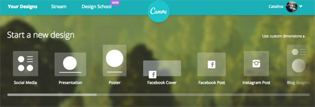
You will need to create an account to use Canva, or log in with your Facebook account. Once you're in, you can choose the type of image you want to create from the pre-existing formats, or you can choose a custom size to work with if you're creating images for your site.

canva format options
Screenshot from Canva.

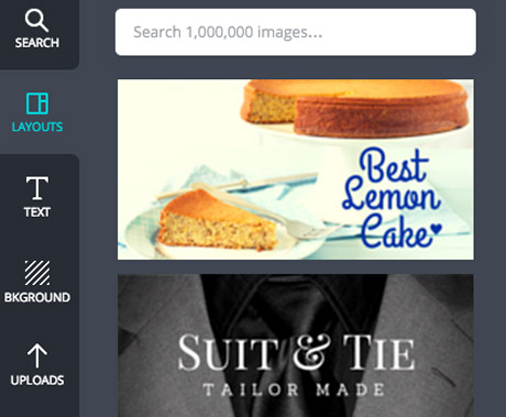
Once you've chosen your size, you can find Canva's design options on the left hand side.

It automatically takes you to the 'layouts' tab, where you can find a number of free templates for images with quotes.

But you can also create your own from scratch, uploading your own images to Canva and using the "background" and "text" options.

canva options
Screenshot from Canva.

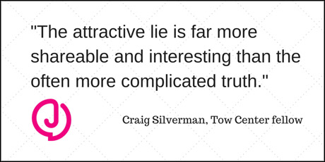
We tested the platform to create a basic image that could be used in a Twitter post, using a pull quote from our story Study: News outlets not doing enough to stop online rumours published last week.

The first step is to choose a background image or colour by clicking on the 'background' tab. The plus sign at the top opens up the colour wheel where you can find your preferred colours.

Alternatively, you can also choose one of the backgrounds provided, including free and patterned options.

Next, we uploaded the Journalism.co.uk logo, as a PNG with a transparent background, to add to our test image.

Canva allows you to either upload images from your computer, or use photos from your Facebook albums.

Once a photo is uploaded, you can drag and drop it onto your work-in-progress, resize it by dragging the corners of the image, and position it where needed within the frame.

There are plenty of ways to add text to your image, and the 'text' tab offers some basic title options as well as a number of designs if you'd like your text formatted in a more visual way.

For the quote in our image, a combination of the main title and subtitle features worked well enough, but you can also customise fonts and colours for free.

Here's the result:

test canva demo
Twitter image, resized to fit Journalism.co.uk site layout.

For more complex designs, or if you want to create infographics or illustrate statistics for social media, Canva has a number of icons and images you can use.

Click on the 'search' tab to access the platform's library of visuals, including shapes, maps, doughnut charts with percentages, and more icons to make your post stand out on social media.

Don't forget to represent your data accurately, and while Canva's design options are plentiful, don't overload your graphic. Check out these tips from freelance infographista Lulu Pinney on what makes infographics successful.

Once you're happy with your photo, you can download it or share it on Twitter, Facebook or email.

The Canva team also writes blog posts with useful tips for designing images for social media, general graphic design advice and more on their Design School blog.
https://www.journalism.co.uk/news/how-to-create-images-for-social-media-with-canva/s2/a564104/

Monday, 9 March 2015

Five Ways to Create Content That Reigns [Infographic]


How can marketers better create content that achieves optimal results? Here are five suggestions from a Captora infographic.
Drive pipeline growth with data: "Research-driven campaigns get results and set your marketing efforts apart from the Internet noise," states Captora.
Some two-thirds of marketers say data drives their digital marketing, and 71% say it enables the delivery of more relevant messaging to more finely segmented audience, according to data cited by Captora.
Another suggestion for creating content that rules: play on those heartstrings. Consumers' emotions often determine their brand choices.
The "most viral" emotions are amusement, interest, surprise, happiness, delight, pleasure, affection, and excitement.


To find out more about what emotions create the least engagement and other tips for creating content that rules, check out the infographic:


Thursday, 5 March 2015

How to Use Visual Content to Trigger More Engagement [Infographic]

Images and visual content attract more social shares, but they also engage your customers, potential customers, and website visitors -- causing them to stay on your website longer. This increases the odds of them converting into a lead or sale.
We are all naturally visual creatures, remembering only 20 percent of what we read, while retaining 80 percent of what we see. While it is obvious that visual content is more effective, simply publishing visual content for the sake of it isn't going to automatically produce favorable results. If you want your images to engage your audience they have to be appealing.
So, what makes images and visual content appealing? You need a compelling topic, the correct colors, a great design, suitable dimensions, and a well thought out promotion strategy designed to deliver a solid ROI.
To help you develop a visual content plan to increase your engagement, my company teamed up with HubSpot to create the infographic below.
2015-02-10-HowtoUseVisualContenttoTriggerMoreEngagementInfographic.jpg