Meet Heather Freeman whom I blogged about here :https://www.blogger.com/blogger.g?blogID=6826802797136711365#editor/target=post;postID=214842492454885403;onPublishedMenu=allposts;onClosedMenu=allposts;postNum=0;src=postname

Showing posts with label design. Show all posts
Showing posts with label design. Show all posts
Wednesday, 6 May 2015
Saturday, 28 March 2015
How to create a quick blog or social media image with Canva for iPad

Canva is a terrific tool for creating all sorts of designs quickly and easily. From social media images such as Facebook covers, Pinterest graphics, or Instagram posts to blog graphics, invitations, and business cards, Canva can do it all.
After you download the app to your iPad and create a free account, you are presented with options to choose which type of design you would like to create. If you do not see what you want in the scrollable list across the top, you can choose “Custom” and enter your own dimensions to get started.
The next screen is where the fun begins. Canva has many items for you to choose from which are categorized by group. There are banners, text holders, frames, buttons, icons, and more. If you plan to spend some time on your design, Canva offers layouts that are really helpful for arranging the pieces of your design. But, if you want to put together something in a hurry you can start with just a basic background from the options available by selecting a pattern and color to get started.
To use any item you choose from the left, you can either click it or hold and drag it onto your canvas on the right.
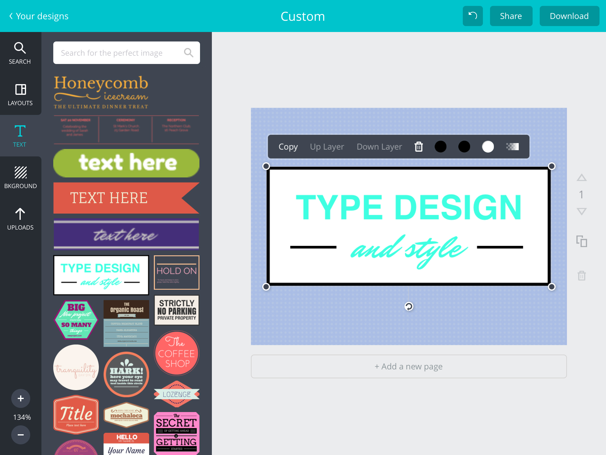
Once an item appears on the canvas, you can hold and move it to resize, rotate, or change its location. Next, just tap any item you have placed on the canvas to edit it. You can normally change colors, layer location, transparency, copy, and delete an item. There is a built-in color palette, but you can also pick a custom color.
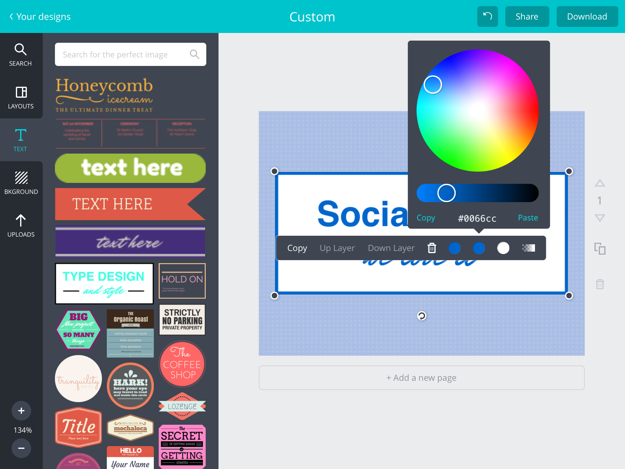
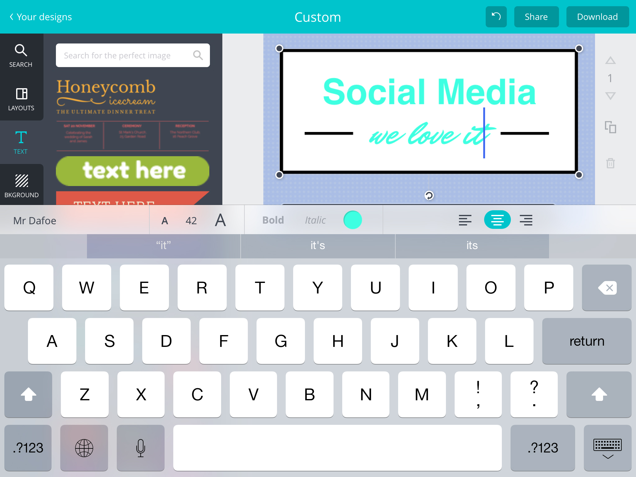
When formatting text, the iPad keyboard will appear with your options for font style, bold, italics, color, size, and alignment.
You have the ability to add more pages to your canvas by clicking the “Add new page” area or selecting the arrow next to the canvas. You can copy and delete pages here as well.
If you have an image of your own that you would like to start with or add to the design the upload feature works great. There is also a search option within your upload area along with a button to take a picture using your iPad’s camera.
Once you have completed your design you can download it as a .png or .pdf file or share it directly to another location such as Facebook, Twitter, Pinterest, or any other location you have added to your “Share” area.

The nice thing about Canva is that it automatically saves your designs as you are working on them. So, there is no fear of losing an image that you have spent time on because you forgot to save it. All designs you have created are displayed on the main screen after you have logged into the app. Each design can be copied or deleted from there. Or, you can just open the design back up for editing.
Most items and images within Canva are free to use, however, there are also in-app purchases available for some items. You can purchase one item or a pack. But, with the many free items Canva offers, you can normally find just what you need.
Canva is currently available for the iPad only. The app is free with in-app purchase options on the App Store.

Saturday, 7 March 2015
Thursday, 5 March 2015
How to Use Visual Content to Trigger More Engagement [Infographic]
Images and visual content attract more social shares, but they also engage your customers, potential customers, and website visitors -- causing them to stay on your website longer. This increases the odds of them converting into a lead or sale.
We are all naturally visual creatures, remembering only 20 percent of what we read, while retaining 80 percent of what we see. While it is obvious that visual content is more effective, simply publishing visual content for the sake of it isn't going to automatically produce favorable results. If you want your images to engage your audience they have to be appealing.
So, what makes images and visual content appealing? You need a compelling topic, the correct colors, a great design, suitable dimensions, and a well thought out promotion strategy designed to deliver a solid ROI.
To help you develop a visual content plan to increase your engagement, my company teamed up with HubSpot to create the infographic below.

Wednesday, 4 March 2015
Content Marketing Strategy Tips by Jo Sabin

Editor’s Note: The following is a guest post from Jo Sabin, marketing communications manager of DesignCrowd, a logo, web and graphic design marketplace. Sabin discusses the ways individuals can make the best use of content marketing — for which brands are increasingly turning to crowdsourcing platforms. As always, guest contributors’ views are their own and do not necessarily reflect the views of Crowdsourcing.org.
Small and medium-sized businesses need a profitable content marketing strategy if they are to remain competitive. If you have never done so before, though, knowing where to start can be very overwhelming and intimidating, especially in light of Google’s recent, crushing updates.
However, a strong plan will help you overcome the obstacles of digital marketing. The following are tips to get you started with a strong content marketing strategy so you can more easily keep up with (and even surpass) your competitors.
Create Buyer Personas
Most businesses already know their general target audience, but narrowing down to an ideal customer gives you a base from which tocreate a buyer persona, an audience segmentation model of sorts, around which you can shape your marketing strategy.
Most businesses already know their general target audience, but narrowing down to an ideal customer gives you a base from which tocreate a buyer persona, an audience segmentation model of sorts, around which you can shape your marketing strategy.
To find your ideal customer, start with your general target market, then choose one segmentation, and pick the best customer to build a persona from. For each persona, describe his or her income, goals, problems, home life, education, possibly region, and also why your company would appeal to this persona. Personas work best, too, if you give them a name and image. This helps you and your sales team ‘see’ personas as real people to whom you are trying to relate.
Define Conversion Goals
Before a buyer makes a purchase, he or she goes through several stages and at each point reaches a conversion point before moving to the final conversion of an actual purchase. Most businesses define the conversion process as first awareness of a product, next evaluation and research, and third the purchase. Your goal with content is to figure out how the buyer will move through the purchase process, and this starts with knowing their questions.
Before a buyer makes a purchase, he or she goes through several stages and at each point reaches a conversion point before moving to the final conversion of an actual purchase. Most businesses define the conversion process as first awareness of a product, next evaluation and research, and third the purchase. Your goal with content is to figure out how the buyer will move through the purchase process, and this starts with knowing their questions.
Ask Questions for Target Audience
When creating questions your buyer persona may have, start at the very beginning. For instance, let’s say a property management company’s list of personas includes a retired male who owns five or fewer rental properties. What questions may lead him to be aware of the need for property management in the first place? Then, when he is intent in searching for a property manager, what questions may he research?
When creating questions your buyer persona may have, start at the very beginning. For instance, let’s say a property management company’s list of personas includes a retired male who owns five or fewer rental properties. What questions may lead him to be aware of the need for property management in the first place? Then, when he is intent in searching for a property manager, what questions may he research?
A newbie rental owner may have no clue about what you offer. So, he may first research how to turn rental properties into passive income. From this search, he may read about property managers. Now he will want to know what services a property manager provides. He will want to know the cost of a property manager, and if the company offers more than one package of services. You can now create content that answers these questions for your target market.
Determine Placement and Promotion
Be sure to consider the best placement for content in each step of the conversion, and how you will promote this content. Placement of content could be on social channels like Facebook and Twitter, third party blogs, your company blog, landing pages, etc. Just make sure to fine tune each placement with the stage of conversion the buyer is at and take advantage of the free targeting tools social media sites offer to ensure your content is posted in the news feeds of the target audience. For instance, emails for those who have voluntarily signed up for your newsletter directly on your blog probably will already be past the awareness stage.
Be sure to consider the best placement for content in each step of the conversion, and how you will promote this content. Placement of content could be on social channels like Facebook and Twitter, third party blogs, your company blog, landing pages, etc. Just make sure to fine tune each placement with the stage of conversion the buyer is at and take advantage of the free targeting tools social media sites offer to ensure your content is posted in the news feeds of the target audience. For instance, emails for those who have voluntarily signed up for your newsletter directly on your blog probably will already be past the awareness stage.
Also, while an audience could just stumble upon your content in a search, this probably won’t be enough. Come up with a plan to direct them to your content with promotional emails, social media, texts, ads, etc. You’ve invested time creating the content and building a business asset, so make sure to invest in distributing the content through relevant channels.
Compile Content List and Timeline
Your entire content marketing strategy will fall apart without cohesiveness and a timeline. Create a list of content for the stage of awareness, for the stage of research, and for the final stage of purchase. You may also have separate content for different personas in each stage. Then create a timeline so that you can keep up momentum and keep track of results. The next level would be to tailor trigger emails to leads you capture via content so they start their journey towards purchase.
Your entire content marketing strategy will fall apart without cohesiveness and a timeline. Create a list of content for the stage of awareness, for the stage of research, and for the final stage of purchase. You may also have separate content for different personas in each stage. Then create a timeline so that you can keep up momentum and keep track of results. The next level would be to tailor trigger emails to leads you capture via content so they start their journey towards purchase.
Think Scalable and Repackaging
If you are worried about keeping up with the amount of content your target market may require of you, then consider creating scalable content that you can repackage. For instance, a series on a certain topic or even simply a group of articles on a topic could be repurposed in an ebook. Weekly email tips could be made into an article or, vice versa, an ebook could be made into short email tips. In 2015, video’s dominance will solidify as more brands use video to connect with their audiences. Facebook has invested in its video platform so expect to see it compete heavily with YouTube this year. There are lots of video making apps to help you turn your static content into short, low cost, engaging slideshows to drive engagement.
If you are worried about keeping up with the amount of content your target market may require of you, then consider creating scalable content that you can repackage. For instance, a series on a certain topic or even simply a group of articles on a topic could be repurposed in an ebook. Weekly email tips could be made into an article or, vice versa, an ebook could be made into short email tips. In 2015, video’s dominance will solidify as more brands use video to connect with their audiences. Facebook has invested in its video platform so expect to see it compete heavily with YouTube this year. There are lots of video making apps to help you turn your static content into short, low cost, engaging slideshows to drive engagement.
Include Keywords and a Call to Action
Every piece of content you produce should include a keyword related to that specific set of questions you are answering. Make sure you test your visual design content as well as text. When Yahoo’s CEO Marissa Mayer was at Google she was famous for testing every design element, including 40 shades of blue to see what shade made users click the most. This decision generated the company anadditional $200M in revenue. Just be sure to write to the buyer persona, not the keyword, and only insert the keyword a few times when it sounds natural. And don’t forget to end with a clear call to action. Ask yourself what you want a reader to do once he or she encounters your content and then make this action clear to the reader.
Every piece of content you produce should include a keyword related to that specific set of questions you are answering. Make sure you test your visual design content as well as text. When Yahoo’s CEO Marissa Mayer was at Google she was famous for testing every design element, including 40 shades of blue to see what shade made users click the most. This decision generated the company anadditional $200M in revenue. Just be sure to write to the buyer persona, not the keyword, and only insert the keyword a few times when it sounds natural. And don’t forget to end with a clear call to action. Ask yourself what you want a reader to do once he or she encounters your content and then make this action clear to the reader.
Once you have your plan in place, you are ready to start writing. Just be sure to use the above tips so that your content marketing strategy effectively turns curious prospects into buyers.
Friday, 16 January 2015
Make a Logo For Your YouTube Channel (Banner, Icon, Profile Picture) - 3D Logo w/ Blender
How to make A Logo Banner for your Blog, Youtube etc...
Saturday, 10 January 2015
Best Infographics for Healthcare
In the run-up to Christmas I went into my favorite used book store in Philly and treated myself to a book on graphic art used in Joseph Pulitzer’s newspaper The World from 1898-1911. One thing that struck me about the New York paper was the pervasive use of infographics to help its readers get some perspective on their city. A quick Google search helped me find what’s commonly referred to as the first use of an infographic in healthcare. Florence Nightingale produced one to demonstrate the causes of death in the Crimean War. It highlighted that the number of British soldiers who died from preventable diseases acquired in hospitals far exceeded those who died from their wounds and other causes.
This year, companies and organizations used infographics to communicate the shifting list of healthcare CIOs’ responsibilities to putting price transparency into practice and ways hospitals and employers are using digital health to try to rein in healthcare costs. Here’s a roundup of seven infographics produced this year that draw attention to trends in digital health and a hint of what’s to come in 2015.

Hospitals innovation priorities and challenges As hospitals continue to explore the potential of digital health tools, it’s worthwhile highlighting what their priorities are and the challenges they face in meeting them. A report by HIMSS and Avia, punctuated with an inforgraphic, found that clinical decision support, disease management, care coordination, patient follow-up and shared decision making have been the top innovation priorities for providers. Cost reduction, patient satisfaction, knowledge sharing and reducing medical errors are on the to do list. But the survey of 92 respondents noted that the number of staff to implement these changes, the limits of EMR systems to provide the level of data needed and the costs of implementing these changes are significant barriers for many hospitals.

Power of the periodic table CB Insights took a cool approach to healthcare deal flow by using periodic tables to spotlight the key players in pharma, biotech and medical device deals such as venture capital and angel investors. It did something similar with the Internet of Things and flagged up wearables, accelerators for digital health and investors in the space, among other things. Price transparency In a year where price transparency continued to grow as a talking point, an infographic illustrating Change Healthcare’s “Health Transparency Index” offered an illustrated analysis of more than 180 million claims from the fourth quarter of 2013. It highlights the biggest healthcare price discrepancies between providers in imaging services like CT scans, ultrasounds and mammograms, and office visits with diabetes screenings.
Price transparency In a year where price transparency continued to grow as a talking point, an infographic illustrating Change Healthcare’s “Health Transparency Index” offered an illustrated analysis of more than 180 million claims from the fourth quarter of 2013. It highlights the biggest healthcare price discrepancies between providers in imaging services like CT scans, ultrasounds and mammograms, and office visits with diabetes screenings.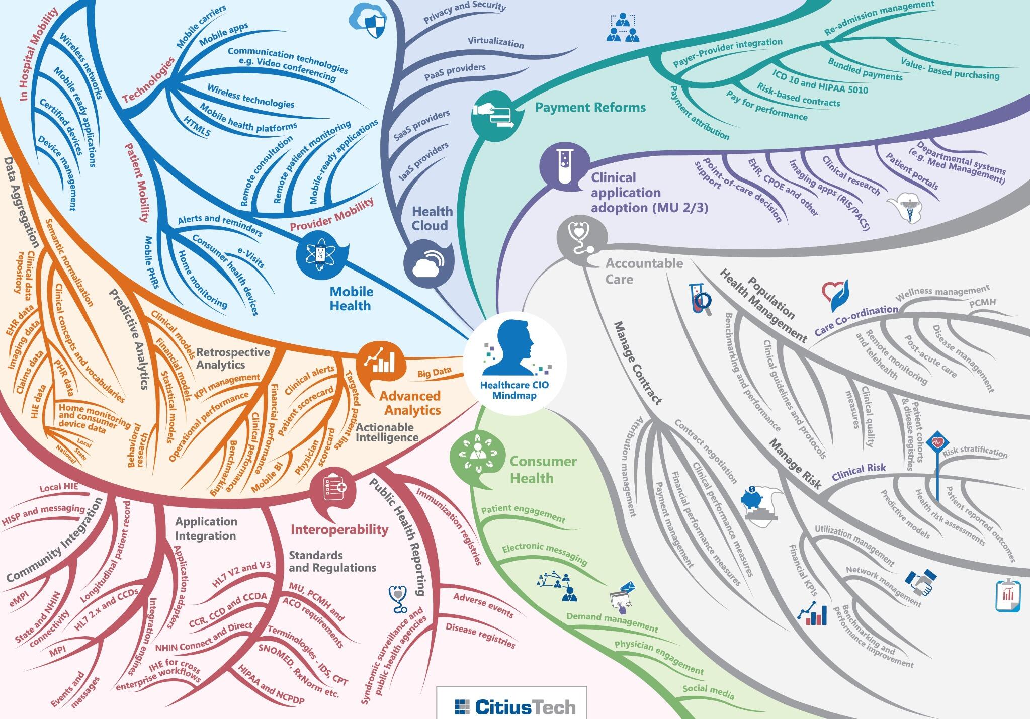
Changing role of CIOs A report from executive search firm SSi Search calls attention to the shifting role of CIOs in healthcare. The infographic highlights their wide-ranging responsibilities in the new order of healthcare assisting in defining and supporting new patient care models, new reimbursement models and supporting numerous regulatory mandates. Their roles will include analytics initiatives, building the clinical skill sets of their teams and seeking greater strategic involvement in their health systems.

Digital health to control costs A Towers Watson survey of 597 employees looked at how employers are using and could use digital health to control healthcare costs. It noted that more than half are tweaking their employer plans to reduce healthcare costs, particularly with telemedicine. About 37 percent of employers said they plan to offer telemedicine by 2015 and another 34 percent said they are considering adopting it by 2016 or 2017, according to the report.

Emerging technology The “Technology Roadmap” from Barkley’s Innovation Lab isn’t so concerned with healthcare trends so much as the future of technology. It does highlight areas that healthcare is only beginning to explore more widely, such as 3D scanning, biometrics, and augmented reality.
 Hand hygiene Remote monitoring was a hot discussion topic this year as was the subject of reducing hospital acquired infections. An infographic from Debmed combined them as part of a survey of hospitals. About one third of hospitals said they were considering a monitoring system purchase to confirm whether employees were washing their hands properly.
Friday, 2 January 2015
Tuesday, 30 December 2014
Friday, 12 December 2014
Are Infographics Right For Your Business? The Pros, Cons, And Tips
Infographics are creative, educational, attention-grabbing, and can be a powerful marketing tool, but are they right for your small business? To help you answer that question, we explain the pros and cons. and have actionable tips to get started.
The pros
Infographics serve as great pieces of content marketing. They can relay otherwise dry statistics in a more compelling way, are super shareable and can help readers visualize information and relationships. Take a look at the example below. Statistics come to life. They’re easy to interpret, explains Carla Mattioli, a creative consultant with IM Design.

“As a graphic designer, it’s my job to produce layouts that will capture a reader’s attention,”she explains. “In this world of instant gratification, infographics allow me to display facts and figures in a way that satisfies an audience’s need for quick and easy-to-read information.”
Read more at http://www.business2community.com/infographics/infographics-right-business-pros-cons-tips-01083989#dTyEw5fuDS3YKZXx.99
Infographics also:
- Diversify your marketing tools
- Appeal to visual learners in your audience
- Increase social engagement as your followers share your infographic
The cons
In most cases, good infographics require a bit of design experience. After all, there’s an art to relaying a lot of information in a small space. It’s not just about choosing precise wording or statistics; it’s also about placement, color choices, font size, style, and images.
We know that a lot of small business owners may not have an in-house graphics or creative team, or the resources to hire a specialist. For a lot of small businesses, that’s the major downside to creating infographics. However, there are DIY tools that can help.
DIY infographics tools
If you’d like to try creating infographics yourself, there here are a few tools to use.
- Piktochart allows you to pick themes from its gallery, customize your infographic with intuitive editing tools and share it on social media or export it to SlideShare or Evernote.
- Easel.ly is a free web-based tool that allows you to choose from infographic templates, then customize them in an easy-to-understand format.
- Venngage not only offers tools for creating and publishing infographics, but it also allows you to animate them.
 Types of info graphics
To create an infographic doesn’t mean you must only use stats and data. So what should or can you create infographics about? Here are some angles:
- Educational: Educate your audience. For example, non-profits can create a timeline that explains how the organization got its start. Service-based businesses can showcase information from a survey that highlights customer satisfaction. We’ve created several educational infographics portraying a variety of digital marketing best practices.
- How-to: Teach your audience a skill. For example, this infographic explains how to clean out a dog’s ears. In this example, a lighting company explains how to layout recessed lighting.
- Statistics: Any time you have a glut of numbers, make them easy to digest in an infographic. For example, non-profits can breakdown donation statistics. Small businesses can highlight common problems like this plumbing company does.
- Comparison: Compare statistics. A non-profit, for example, could compare the level of need in the community today versus five years ago. A small business could compare the cost of materials to help customers make an informed decision.
- Guides: Create a visual guide. Consider making a beginner’s guide to a topic that’s relevant to your business or nonprofit. Here’s a Beginner’s Guide to Sushi.
http://www.business2community.com/infographics/infographics-right-business-pros-cons-tips-01083989
Friday, 28 November 2014
How to make the Best Cover Images For Your Social Media Accounts
You can't always judge a book by its cover, but you can judge a social media profile by its cover image. In this column, you’ll learn how to make your own cover images for Facebook, Twitter, Google+, and LinkedIn, including design ideas, correct sizes, and sage file format advice. This is your chance to get creative and let your personality shine—after all, an image is worth a thousand words!
Size Matters
The imagery you use for cover images among social media services doesn’t have to be different, though each service wants slightly different pixel dimensions. While you can crop and reposition the image during the upload process, sizing it correctly ahead of time gives you more control and lets you plan for areas of the image that’ll be covered by your profile picture or text overlay. Below are the currently recommended sizes for today’s popular players (all sizes are in pixels), and while some services accept larger images, the sizes below work well on both desktop and mobile devices:
Facebook: Covers for personal or fan pages are 851x315. Your profile image is shown as overlay in the lower-left, with your name as a text overlay to its right. Facebook Groups have cover images of 801x250.
Twitter: Cover images are 1500x500. Your profile image is shown as overlay in the lower-left, with your name and bio appearing beneath it.
Google+: Cover images are 1080x608. Your profile image, name, and URL are shown to the left of your cover image, not as an overlay.
LinkedIn: LinkedIn’s cover images are 1400x425, but they’re currently for Premium (paid) accounts only. No overlays are shown atop the cover image.

Profile image sizes vary across services, too, though they’re always fairly small. A good rule of thumb is to upload a portrait-style photo of yourself—or your company’s logo if it’s a business page—and then use the service’s cropping feature to make your head, neck, and shoulders fill the frame.
Building the cover image
To make a great cover image, you need an application that lets you create a custom document size, and add more than one image to that document, as well as text. Such programs include TurboCollage ($5), Pixelmator ($30), Adobe Photoshop Elements ($100), Adobe Photoshop CC ($10/month with an Creative Cloud Photography subscription), and the like. (With enough skill you can do it in Aperture or Lightroom, but that’s fodder for another story—it involves creating a custom paper size in the Print module, designing a new print template, and then using the identity plate and watermarking to add a logo and text.)
Perhaps the easiest program to use is Photoshop Elements 13; it sports a new Facebook Cover option in the Editor’s Create menu that makes a perfectly sized cover (and profile image) from one or more images using a variety of templates.

No matter which application you use, the first step is to create a new document at one of the sizes listed above, generally by choosing File > New and entering the correct dimensions and resolution (use 72ppi). Next, start importing imagery into your document and arrange the important bits so they’re not covered by any overlays the service tacks on. To be safe, don’t set any text inside the bottommost 145 pixels.
What to include
To make the best impression, use odd numbers of your very best images. Choose high-quality images that best reflect your personality or hobby. Use images you’ve shot yourself, purchased from a royalty-free stock image company, or those that are in the public domain or have generous usage rights (NASA’s Visible Earth images, for example). But don’t use images you’ve snatched from the Internet using a Google image search.
If it’s a personal page, give your cover image extra personality by adding a favorite motto, such as “practice aloha” or “It’s 5 o’clock somewhere!” Just keep it clean and keep it short. Remember, the whole world can see this, including current and future friends, family, mates, even bosses.

If it’s a business page, be sure to include your URL and tagline so it’s highly visible. If you have a product for sale, include a picture of it to increase brand recognition.
Save it in the right file format
When you’re finished, first save a master copy of your document in the software’s native format so you can edit it again later. Next, use the software’s File > Save As command to create a JPEG or PNG copy in that you’ll upload to the service itself.
The JPEG format produces a smaller file size, though PNG produces a higher-quality image because no data is lost when it’s compressed. So if your cover image includes a logo or text, use PNG–8. If it includes a large gradient—a smooth transition from one color to another, like in a big sky—use PNG–24, which supports more colors than PNG–8 (and therefore creates a larger file size). For anything else, use JPEG at the highest quality setting.
Facebook is notorious for compressing JPEGs even further during the upload process, so if your cover image looks blurry, try PNG–8 or PNG–24 instead.


Keep these tips in mind, and your social media cover images will look their best and send the right message. Until next time, may the creative force be with you all!
PhotoLesa.com founder Lesa Snider teaches the world to create better graphics. She’s the author of the best-selling Photoshop: The Missing Manual books, coauthor of iPhoto: The Missing Manual, author of The Skinny Book ebook series, a founding creativeLIVE instructor, and regular columnist for Photoshop User and Photo Elements Techniques magazines.
Friday, 21 November 2014
The Best Infographics of 2014
It takes a good deal of effort to draft, design, and finalize an infographic, but it doesn't take a lot of effort to read an infographic -- which is exactly why people love them so much.
Humans have short attention spans and, let's face it, the internet is cluttered. To stand out, boost engagement, and increase shareability, many marketers have turned to visual content -- especially infographics. They're an awesome medium to use to share facts, tips, and tidbits of information in a way that's easy for people to understand and remember.
The best infographics are clear, easy-to-follow, contain useful information, and have colors that go well together. Here are 11 brands from all different industries -- from real estate companies to paralegal programs -- that totally nailed their infographics this year so far. So scroll on and get inspired!
11 of the Best Infographics From Brands This Year
1) The Blogging Food Groups: A Well-Balanced Diet of Content, by LinkedIn Marketing Solutions
One great use of infographics is to illustrate and explain an analogy via visuals -- and who doesn't like food analogies? Since blogging is such a big fuel source for the content mix, Jason Miller of LinkedIn Marketing Solutions borrowed (and properly cited) an analogy originally coined by HubSpot’s Rick Burns in 2009 and turned it into a great piece of visual content showing how blogging is such a big fuel source for the content mix. Analogies work very well in infographic form.

2) Dining Etiquette Around the World, by The Restaurant Choice
Did you know it's rude to tip restaurant servers in some countries? Gift voucher company The Restaurant Choice created this cool infographic to show cultural changes in dining etiquette around the world -- while hinting that their network has global reach. We love that this infographic isn't heavy-handed on the product mentions, but still is intriguing enough for you to want to check out their website (which you know because it's clearly displayed at the bottom).

3) Travel Hacks, by Best Hospitality Degrees
Best Hospitality Degrees is a resource for people looking for a hospitality degree program that's right for them, and this infographic shows they're dedicated to arming degree seekers with hospitality wisdom from the very beginning. We love how on-target this is for Best Hospitality Degrees' buyer personas (young, adventurous, smart people) -- and the color palette is top-notch, too.

4) You Have the Right to Stay Out of Jail, by Online-Paralegal-Programs.com
While this infographic's design is a little busy, it's packed with well-researched and incredibly useful information for human living in or visiting the United States. My favorite part is the "Miranda Rights" section, which gives an example of a realistic conversation you might have with a police officer trying to trick you into giving information you don't legally have to give. We love how they anticipated our questions -- even the uncomfortable ones -- and gave us on-point, thorough answers.

5) How to Use Cinnamon Sticks, by Frontier Natural Products Co-op
Who knew there were so many uses for cinnamon sticks? This infographic was introduced in a blog post about the health benefits of cinnamon. The icons are consistent in color and design, and they're spaced out well so they're easy to read. Also, the warm colors and wood background make me want to put on a huge sweatshirt and curl up by the fire with some hot cocoa -- which is exactly what they were going for.

6) Wedding Planning Timeline, by LaurenConrad.com
Sometimes, all you need is a simple, clean layout to get your point across. Lifestyle, beauty and fashion website LaurenConrad.com nailed this approach for this Wedding Planning Timeline infographic. Infographics are a great way to show timelines, as long as the design is consistent so it's easy to follow. I can see brides-to-be everywhere printing this out and crossing each item off the list -- plus, the pink-and-white color palette is appropriate for the topic while also consistent with their branding. Well done!

7) How to Protect Yourself From Package Pillagers, by Endicia
This is a great example of an infographic that tells a story. Endicia, an online postage and shipping company, created it to educate people about package theft -- probably as a resource to send people who tell them their package has been stolen. We love how they started with the baseline statistics and then moved logically from one section to another, ending with what we can do to prevent packages from being stolen in the future. The narrative is fluid and cohesive -- just like a blog post.

8) Your Brain on Beer vs. Coffee, by ILoveCoffee
This infographic is as entertaining as it is informative. The creator of this infographic, a Japanese blogger named Ryoko, curated all the information from this infographic from an article she read about whether beer or coffee makes you more creative. She borrowed (and properly cited) the information and turned it into an easily readable, skimmable, and shareable infographic that's much easier for the human brain to digest than the blog post itself. We love the fun icons, fonts, and color scheme because they match with the playfulness of the topic. She also made the conclusion really clear for skimmers, by labeling it "CONCLUSION" and making the conclusive points short and simple.

9) Color, Value & Evolution of Logos, by RubyMediaCorporation
What does your logo color really mean, and what does it say about your company? This is an example of a long-form infographic packed with substantial research, which makes it a really fascinating read. It starts with the information everyone wants to hear -- which colors are associated with which attributes -- and flows into answering more nuanced questions, like how much logos cost. We love that they included recognizable brands as examples throughout. They also played off our nostalgia by featuring logos that have changed significantly over the years.

10) Bob's Burgers Restaurant Valued at $796,446, by Movoto
This infographic is probably the most creative one of the bunch. Cambridge-based real estate company Movoto successfully took a pop culture topic -- the hit television show Bob's Burgers-- and used their expertise to create a clever, relevant, and shareable infographic about it. We love that it follows a train of thought, from a line in a TV show ("the rent is too damn high") to "I wonder how much the rent would be if this place really existed?" and exactly how Movoto got from A to B. The question-and-answer format here is engaging for readers and makes us feel like we're part of the process.

11) Keeping Track of Baby Habits, from PishPoshBaby
Finally, we have this timeline infographic from PishPoshBaby, an online resource for new or soon-to-be parents. Timeline infographics are done best when every time period has a consistent design, which PishPoshBaby executed really well: The stage names are always on the left, and the categories -- Sleeping, Feeding, Playtime, and Senses/Motor Skills -- are all in the same place as you move down the page. It's very easy to read and follow. We also love that they used gender-neutral colors like beige and yellow in addition to the predictable pink and blue, making it relevant for both baby girls and boys.

Monday, 17 November 2014
Tuesday, 11 November 2014
Making Money Online For Free; The World Of Website Building, Personal, Commercial, Non-commercial, Religious, Informative, Revolutionary
There are many categories of sites: personal, commercial, non-commercial, religious, informative, revolutionary, etc. This all depends on the individual or group who want their products or services published in the internet. The only distinction between all these sites is financial: are they building websites for income or simply to inform or have fun?
Website building became popular in the middle of 1990s where new-found technology innovations were discovered in the internet world making it an excellent tool for communication or advertisement worldwide.
Among these sites, commercial sites top them all. Why? It generates millions of bucks by simply building the website into an attractive handiwork of information technology that sells products easily and in big volume. Websites now are electronically capable to accept orders with outright payments using financial instruments like Credit Cards that make it easy for seller-buyer their transactions in seconds.
Other sites like religious or charitable organizations find it easy to collect donations worldwide through the internet. They will just have to post pictures and short articles of particular areas of humanitarian concerns in the website and this will garner support from different sectors of society worldwide.
Other companies make use of websites in posting job vacancies where on-line application forms and resume uploads are added to other features in the site. This attracts applicants faster than the usual walk-in process of job inquiry. It saves time and effort as well as reduces expenses entailed on traveling everyday to the company headquarters offering job opportunities.
How websites are designed give weight to how customers will patronize your product or services. Proper presentation in the web of your products will contribute to its success in sales. Many website owners sometimes don't achieve sales targets because of their failure to learn how to properly design their sites.
The homepage of your website must specifically inform visitors what are your products and the benefits they will derive when they buy. Remember, visitor's purpose of browsing your site is to know what you offer. If, they failed to get any valuable information first time they visit your site, surely, they will not come back.
Subscribe to:
Posts (Atom)